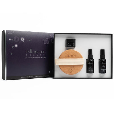
Packaging uplift - A fresh new look

We are excited to introduce our Packaging Uplift and hope you will love it as much as we do.
To be true to our whole-istic approach, the new placement of the watercolour was chosen to echo a sense of calm, flow, beauty and freshness and accompany the transformational journey our products take you on.
We have chosen to separate the watercolours (compared to the previous overlay) to make each colour more prominent with their message;
however the original watercolour design still remains - it has just evolved.
THE MEANING OF COLOUR
Inlight’s core blue/grey watercolour is the colour of abundance, wisdom and confidence, it’s the colour of the sky and the sea. Two elements essential to life and from which we gain sustenance and inspiration.

The colour pink in our Face Collection is associated with giving and receiving care, compassion and love.

Yellow represents the sunshine, linked with joy, happiness and energy and is used to represent our Body Collection products.
The grey blue contrast with the bright pink and yellow are also chosen to remind ourselves that there is always a brighter and lighter alternative in every choice we make.
SYMBOLS & SUSTAINABILITY
After much searching we are pleased to have sourced a laminate made from wood cellulose for our outer packaging; this gives strength to the boxes whilst giving them a luxurious feel that is truly sustainable.
Please bear with us in the next month during this transition from 'old' to 'new'! Rest assured the quality of what's inside the boxes remains as good as ever!




.png?v=1709810460212)





.png?v=1724255750489)




.png?v=1724250433717)


